Jerrold Brantley, who works in the Robert W. Woodruff Library, asked the other day who designed the Emory logo. He noted the Goudy Old Style word mark above the shield and the chip that appears to be missing from the upper-left corner. That word mark dates from the early 1980s, when Steve Bollinger, then the director of creative services, decreed that the university’s logo should be the all-caps single word EMORY in the elegant Goudy Old Style font. The missing chip is another story, in just a minute.
The current logo has its origin in the university seal, which is described in the University Bylaws, Article VII. Here’s an image of the seal:
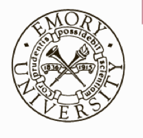
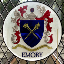
Notice the crossed torch and trumpet, representing the light of learning and the proclamation of truth. The shield with the crossed torch and trumpet also appears in the university’s elaborate coat of arms, which hangs over the fireplace at the Miller-Ward Alumni House, and which was designed in the 1970s by the late Candler Professor of Medieval History George Peddy Cuttino.
In the mid-1990s Vice President for Communications Curt Carlson undertook a “graphic identity” redesign to bring the various school and departmental logos more into harmony. Some schools were using colors different from the university colors, and some departments and professors and others were designing their own sometimes odd business cards and stationery. Curt brought in the design team of Malcom Grear and Associates, from Rhode Island — the same firm that designed all of the logos for the 1996 Atlanta Olympics. After much consultation and study they came up with the logo we now use, which includes a version of the shield that looks to some folks like it has a chip out of the upper left corner. That actually comes from the orthographic drawing intended to make the shield look three-dimensional.
Gary Hauk
